arrow_backAll free tools

Image Resizer

Resize any image to every LinkedIn standard dimension, or a custom size, with cover or contain. Exports at the exact pixel size. Free, no login, nothing leaves your browser.

1Upload your image
upload
Drag & drop, or click to choose
PNG, JPG, WEBP or GIF · you can also paste (Ctrl/Cmd‑V)
check_circleimage loaded
Please choose an image file.
2Choose a size
Custom size
×

LinkedIn image sizes are from the platform's published ad specifications. Video sizes use LinkedIn's standard aspect ratios at 1080p.

3Fit & format
How the image fills the frame

Cover fills the whole frame and crops the overflow, no bars, no distortion.

Download format
4Download

Exports at the exact target dimensions, exactly as previewed. Add your image to enable the download.

aspect_ratio1200 × 1200 crop1:1
Live preview · pick a size to see it instantly
LinkedIn image sizes

LinkedIn image size and resizing questions, answered

The specs, the safe zones, and the quality rules a B2B marketing team needs so every image lands sharp, correctly cropped, and on-brand in the feed.

What are the correct LinkedIn image sizes?

For single-image posts and single-image ads there are three shapes worth knowing, and this tool exports all of them at exact pixel dimensions:

  • Landscape, 1200 x 628 (1.91:1). The classic link-preview shape. Safe everywhere, but it occupies the least vertical space in the feed, so it works hardest when the image itself is doing the persuading.
  • Square, 1200 x 1200 (1:1). The reliable default. Renders consistently on mobile and desktop and takes up meaningfully more feed real estate than landscape.
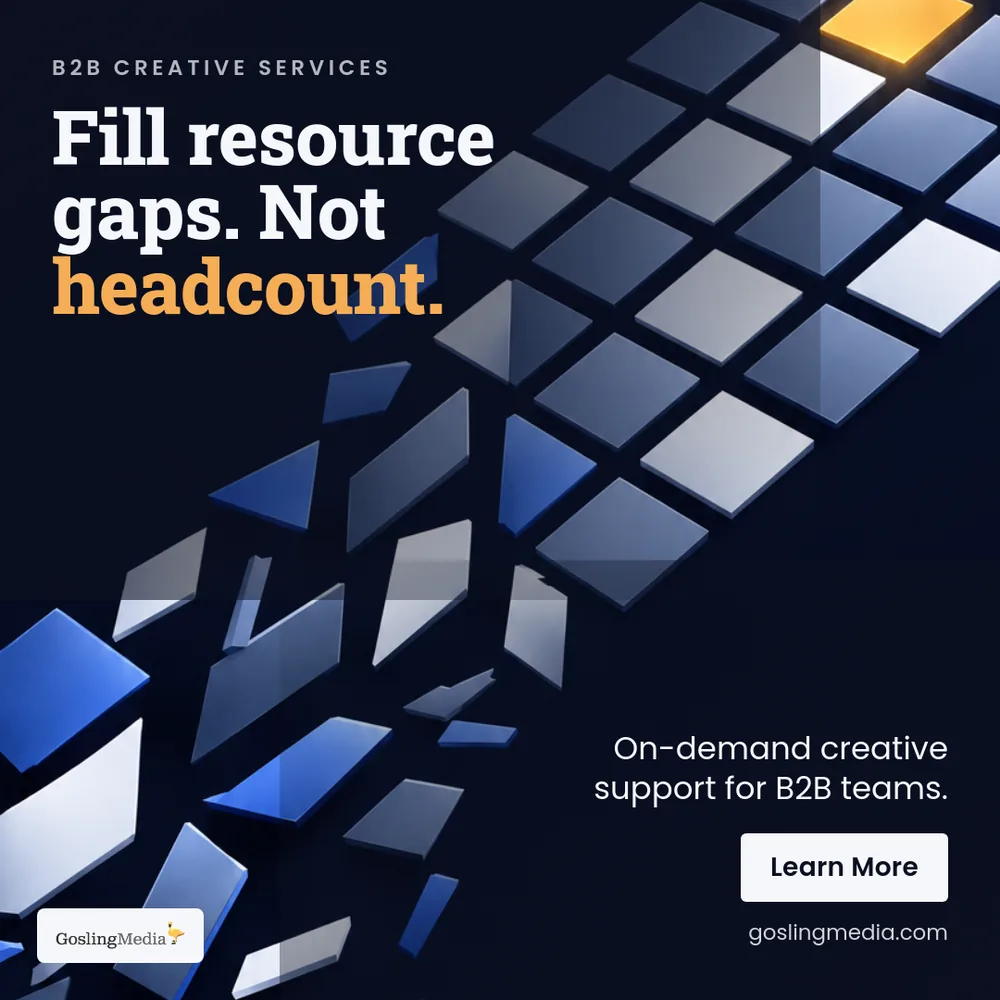
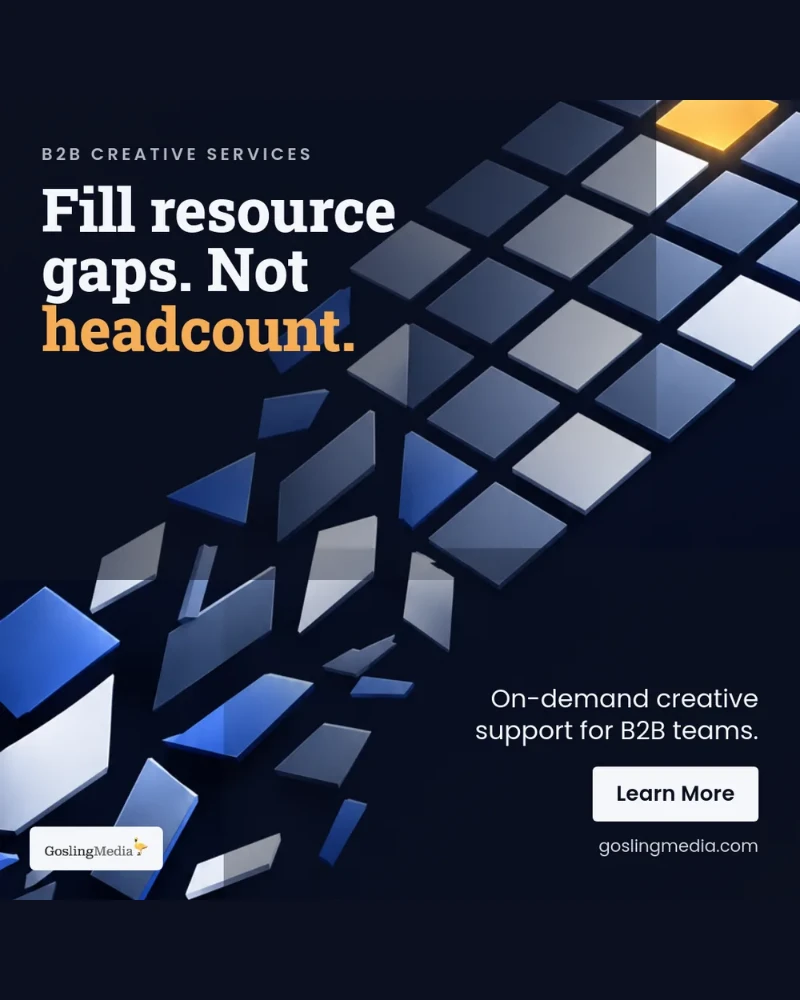
  • Vertical, 720 x 900 (4:5). The largest mobile footprint LinkedIn allows for a still image, and therefore usually the best performer on a platform where most scrolling happens on a phone.

For video, LinkedIn's standard ratios rendered at a 1080p base are 1920 x 1080 (16:9), 1080 x 1080 (1:1), 1080 x 1350 (4:5), and 1080 x 1920 (9:16). Carousel and document pages should be square at 1080 x 1080. Always export at the exact target size rather than uploading something larger and hoping LinkedIn crops it well.

What size should a LinkedIn carousel or document post be?

A LinkedIn carousel is not a separate post type, it is a document post: a PDF that the feed renders as swipeable pages. Build every page at 1080 x 1080 (1:1) and keep every page in the document at the same dimensions. Mixed page sizes are the most common reason a carousel renders with unexpected letterboxing or crops.

Square is the right default because it maximizes mobile footprint while staying safe on desktop. Vertical 4:5 pages are also accepted and take even more mobile screen, but they are more prone to awkward rendering in the desktop feed, so square remains the safer choice for a document that will be seen on both.

Design for the thumbnail as much as the deck. Page one is the only page most people will ever see, so it has to carry the hook on its own, at a size where the headline is legible on a phone held at arm's length. Keep every page to a single idea, and put a clear call to action on the final page.

Should I post square, portrait, or landscape images on LinkedIn?

Choose by how much vertical space you want in the mobile feed, because screen real estate is the closest thing to a free performance lever on this platform.

Vertical (4:5) takes the most space and therefore usually earns the most attention and dwell time. It is the strongest default for organic posts aimed at a mobile audience. Square (1:1) is the safe all-rounder: it renders predictably everywhere and is the correct choice when the same asset has to work in a carousel, an ad, and an organic post. Landscape (1.91:1) is right for link previews, for wide diagrams and dashboards that genuinely need horizontal room, and for creative that will be reused on other channels.

Whatever you pick, be consistent within a campaign. A feed where every asset from your brand has the same shape and the same visual system compounds recognition in a way that a mixed bag never does.

PNG or JPG: which format should I use for LinkedIn?

Use PNG for anything with text, logos, flat color, screenshots, charts, or a transparent background. PNG is lossless, so type edges stay crisp and there is no compression mush around lettering. This covers most B2B creative, which is usually text-forward.

Use JPG for photography and rich gradients, where lossless compression buys you nothing but a much bigger file. A large PNG photograph gets recompressed by LinkedIn anyway, and you have no control over how aggressively.

A practical rule: if your image contains a headline, export PNG. If it is a person, a product shot, or a scene, export JPG at high quality. Keep the file comfortably under 5 MB, which is LinkedIn's limit for ad images, and avoid GIF for anything that matters, since it is limited to 256 colors and will band badly on brand gradients. Video is the better answer for motion.

Why does LinkedIn make my images look blurry or compressed?

Almost always one of four causes, in order of frequency:

  • You uploaded the wrong dimensions and LinkedIn rescaled the image for you. Any resampling the platform performs is optimized for file size, not for your typography. Exporting at the exact target size removes the platform's scaling step entirely.
  • You upscaled a small source. Enlarging a 400 px image to 1200 px cannot invent detail. Always start from the largest original you have.
  • You saved a text-heavy graphic as JPG. JPG compression artifacts cluster exactly around high-contrast edges, which is to say around every letter. PNG solves this.
  • Your file was very large and got compressed harder on upload. Export at the exact size you need rather than at 4000 px wide.

There is also a screenshot trap worth naming: taking a screenshot of a design, then resizing the screenshot, compounds two lossy steps. Always export from the source file.

Cover or contain: which fit mode should I use?

Cover fills the entire frame and crops whatever overflows. Nothing is distorted and there are no bars, but you lose the edges. This is the right choice for photography, backgrounds, and any image where the subject sits comfortably in the middle. It is the default for a reason: a full-bleed image always looks more professional in the feed than one floating in padding.

Contain fits the whole image inside the frame and pads whatever is left over with a color of your choice, or with transparency if you export PNG. Use it when nothing can be cropped: logos, full charts, screenshots of an entire interface, product shots that need their full silhouette.

The mistake to avoid is contain with a white pad on a design that assumes a dark feed, which produces a bright rectangle floating in a dark scroll. If you must use contain, set the padding color to your own brand background so the result reads as one deliberate composition rather than an accident.

Where should text sit, and what are LinkedIn's safe zones?

Keep all critical text and your logo inside the middle 80% of the frame, leaving roughly a 10% margin on every side. LinkedIn crops differently across the mobile feed, the desktop feed, notification previews, and reshares, and content near an edge is the first thing to disappear.

Size type for a phone, not for your monitor. A 24 px headline in a 1200 px square renders at a few millimeters on a handset. As a working rule, headline type should occupy at least 6% to 8% of the frame height, and body type should never drop below about 3%. If you have to lean in to read it on your own screen, it is invisible in the feed.

Contrast matters as much as size. Aim for a contrast ratio of at least 4.5:1 between text and background, and put a scrim or solid shape behind type that sits over a photograph. Elegant thin type over a busy image is the single most common reason a beautiful asset performs badly.

Do I need different image sizes for organic posts and ads?

The dimensions overlap almost entirely, so the same 1200 x 1200 square or 1200 x 628 landscape works in both places. What differs is the constraints around them.

Ads carry file size and format limits that organic posts treat more loosely, so keep ad creative under 5 MB and in PNG or JPG. Ads also render alongside a headline, an introductory text field, and a call to action button, which means the image is competing with, and should complement, more surrounding copy. Organic posts give the image more room and let the caption carry the argument.

The most important practical difference is volume. A single organic post needs one image; a properly structured ad campaign needs four to six creative variants per campaign, refreshed every two to four weeks, and often in more than one shape. That multiplication is exactly where manual resizing stops being viable and production has to be systematized.

Can I resize a small image up without losing quality?

No. Enlarging an image cannot add detail that was never captured, so a 500 px logo scaled to 1200 px will look soft no matter what tool performs the scaling. This tool will happily do it, and the preview will show you honestly what it looks like, but the physics do not change.

The fixes, in order of preference: find the original asset at full resolution; ask for a vector version, since an SVG or EPS logo can be exported at any size perfectly; recreate the graphic at target size; or redesign the composition so the small asset is used small, sitting inside a larger layout rather than being stretched to fill it.

The general rule is to always resize down from the largest source you have. Downscaling is essentially free in quality terms. Upscaling never is.

How do I resize a whole campaign's worth of images efficiently?

Work from one oversized master per concept, then export down. Design the asset at the largest dimension in your set, keep the important content inside a central safe area that survives every crop, and export each required size from that single source. This avoids the trap of resizing an already-resized file and stacking quality loss.

Then be honest about the arithmetic. A single LinkedIn campaign done properly needs several creative concepts, each in square, vertical, and landscape, refreshed every few weeks, plus a document version and often a video cut. That is dozens of exports per month, per campaign, and it is the reason so many teams talk about repurposing and testing far more than they actually do it.

At that point the answer is not a faster manual workflow, it is producing every size from a single source automatically, with brand rules already applied. That is exactly what DesignTech AI does, and this resizer is the free, single-file version of the same idea.

Is this image resizer free, and do my images get uploaded anywhere?

It is completely free, requires no login or email, and has no usage limit. Just as importantly, nothing is uploaded. The image is read, resized, and exported entirely inside your browser using a canvas element, so the file never touches a server, is never stored, and is never seen by anyone but you.

That makes it safe for unreleased product screenshots, client work under NDA, and anything else you would not put through an anonymous upload site. Every export is at the exact target dimensions, exactly as previewed, in PNG or JPG.

Resizing is step one. Ship the real thing.

DesignTech AI produces finished, on-brand posts and ads sized for every LinkedIn format, ready to launch, from the content you already own. No more manual resizing.

arrow_forwardTry it free