An infographic is a tall, top-to-bottom visual story: the best data, headlines, and takeaways from a source, arranged into a sequence a reader can scan. Done well it is one of the most shareable assets a B2B team can make. Done by hand it is a designer-only artifact, and done by a generic AI tool it is usually a bespoke, off-to-the-side feature with its own one-off review canvas that behaves differently from everything else you produce.
We retired exactly that off-to-the-side approach on purpose. An infographic should be a vertical deliverable in the one production editor you already use for every other asset, grounded so tightly that every stat traces to the block it came from. Here is why that matters and how it works.
The real problem: data viz that no one can trust or maintain
Two things go wrong with infographics.
The first is trust. An infographic is dense with numbers, and numbers in a visual carry an air of authority whether or not they are correct. A tool that generates stats loosely "inspired by" a source produces confident-looking data viz you cannot actually stand behind. For a shareable asset that will travel beyond your control, that is a real liability.
The second is consistency. When the infographic tool is a separate path with its own review surface, it does not behave like the rest of your production. You learn one set of controls for infographics and another for everything else, and the asset lives in a silo. That is the "no capability may hide behind the UI" problem: bespoke, per-medium sprawl instead of one consistent surface.
Our take: one production surface, block-level provenance
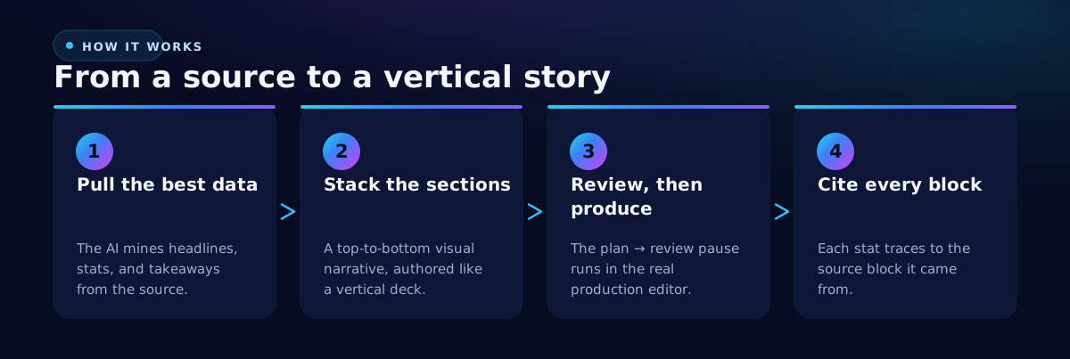
The Design an Infographic Job runs the same plan-review-produce loop as every other designed asset, with the deliverable type pinned to infographic. You review and produce it in the real production editor, on the verified path, not a one-off canvas.
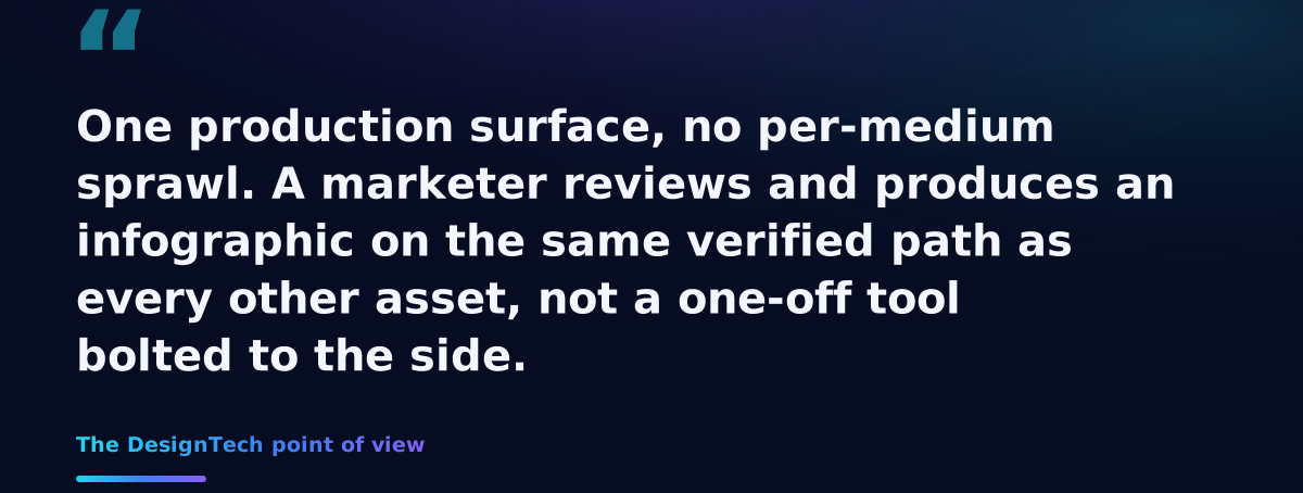
One production surface, no per-medium sprawl. A marketer reviews and produces an infographic on the same verified path as every other asset, not a tool bolted to the side.
Structurally, an infographic is authored like a carousel, just vertical: the engine pulls the best data, headlines, and takeaways from your source and arranges them into stacked sections, top to bottom, as one coherent visual story. It is authored by the design model, imagery composed by the image model, and themed on your brand style preset.
Why block-level provenance is the trust feature
Here is the mechanic that makes an infographic's data trustworthy: provenance is attributed at the block level. Every generated element cites the specific source block it came from, and those citations are validated against the real source set. A hallucinated citation is dropped. So a stat in the finished infographic is not a number the model felt confident about; it is a number that traces to a specific place in your source.
This is the difference between data visualization and decoration that looks like data. Nothing in the infographic is concatenation in costume. Each figure has a lineage you can follow back.
Interactive, and editable like everything else
Unlike a one-pass carousel, the infographic Job is interactive: it plans the sections, pauses for you to review in the unified production editor, and then produces. After production, it opens in the same direct-manipulation editor as every other spatial asset, with the same inspector, layers, add-element, background, and undo controls you already know. You refine the exact section that needs it rather than re-rolling the whole thing.
Export is a single combined tall PNG or PDF, the whole vertical composition rasterized into one image or page, ready to share or embed.
The strategic point is the same one that runs through the whole platform: the same skeleton, every asset. An infographic is not a special case with its own rules. It is the vertical instance of the one production process, grounded in your data, on-brand by construction, and editable on the path you already trust.
Related: turn your raw numbers into on-brand charts and dashboards, and design the sales collateral that reuses the same data.