The carousel is the single highest-engagement organic format on LinkedIn for B2B, and it is also the one most likely to make a marketing team wince. A good carousel needs a designer: a Figma or Canva round-trip, manual brand application, and a real eye for how a stat slide should look different from a quote slide. A lean team cannot get that design time for every idea, so most carousels ship looking like the template they were poured into, or they do not ship at all.
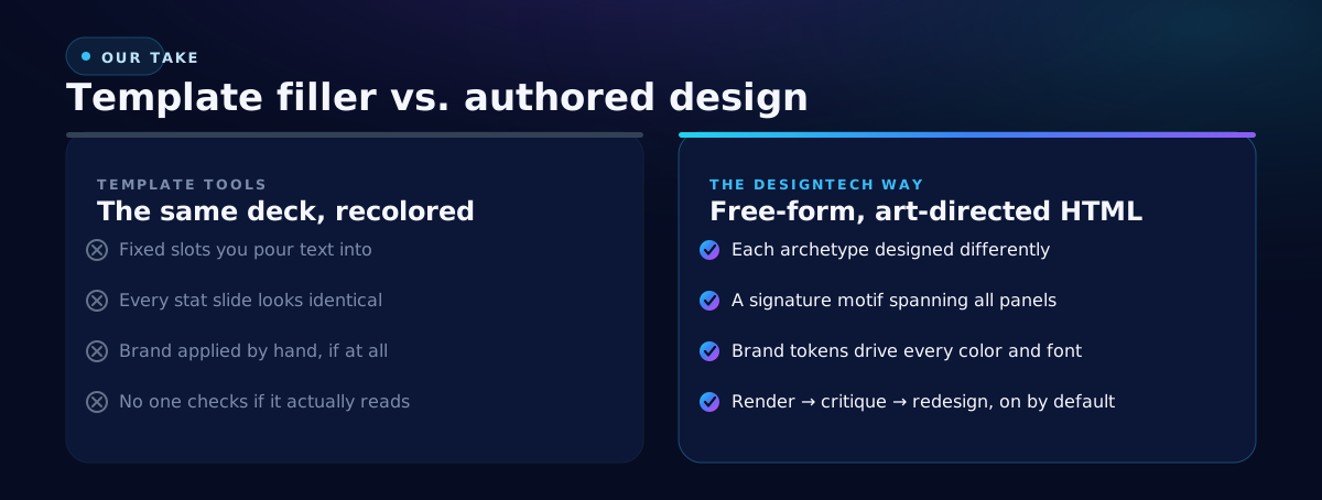
The usual AI answer is worse: fixed slots you dump text into, where every stat slide looks identical, the brand is applied by hand if at all, and no one checks whether the finished slide actually reads. That is not design. That is a form with rounded corners.
We hold carousels to a different bar. The acceptance test is not "it rendered." It is "a leading creative agency would be proud to present this to a client." Here is how a machine clears that bar.
The real problem: agency-grade design does not scale by hand
A marketing team produces hundreds, sometimes thousands, of assets a year, at real expense. The carousel sits at the intersection of two hard constraints: it is high-value enough to deserve real art direction, and high-volume enough that real art direction never happens. So teams compromise, and the compromise is visible in the feed.
The deeper failure is the one every template tool shares: it treats design as layout. Pour the content into the slots and recolor. But design is not layout. A carousel that lands is a sequence of deliberately different slides, a cover, a big-figure stat, a quote, a listicle, a comparison, a process flow, a call to action, that nonetheless read as one coherent system. Templates cannot do that, because a template is one layout wearing different text.
Our take: free-form authoring, art direction as the gate
Two convictions shape how carousels are made in DesignTech AI, whether you press the Social carousel app or ask the Studio for one.
Brand is applied by the engine, not the user. Nothing is styled by hand. The deck is designed in your Brand Kit's colors, fonts and logo, so on-brand is the default rather than a finishing step.
Art direction is the acceptance test. The carousel is designed slide by slide as free-form layout, not assembled from slot templates, because free-form design is the quality ceiling. Then the Studio looks at what it rendered and revises what does not read: text crammed beside a dead half, words broken mid-word, type too small to read at arm's length on a phone.
Not "competent," not "on-brand and fine." The bar is a deck a leading creative agency would be proud to present to a client.
How it actually works
The Social carousel app makes the deck an argument, not a summary:
- Read it and find the argument. It reads the source you pick from your Gallery and finds what it actually argues: its thesis, the proofs it offers, the objections it anticipates. If the source argues nothing, it says so and asks for something that does, rather than inventing a spine.
- Shape the swipe. The hook card is the claim itself, said plainly. Each card after it carries one proof. Near the end comes the turn, the obvious objection and its answer, if the source anticipates one. The close says what the reader should now do or think.
- Design the cards on brand. Every card carries one idea, in short lines, designed as a set in your brand, with imagery where it earns its place. It never states a figure or a quotation the source does not contain.
The Studio's Design carousel slides capability makes 3 to 8 individually art-directed portrait slides, each one an editable page that exports to PNG and PDF. You are not re-rolling the whole deck to fix one headline. You open the slide and change the headline.
From carousel to video, and back to the source
Because the carousel is a real, structured asset and not a flat image, it has a second life. Animate a carousel into video turns the deck into an MP4 where each card's own text animates in, rather than a content-blind pan-and-zoom that crops your text. The length follows the words: each card is held for as long as its words take to read, about a second for every three words and never less than two and a half seconds, and you are told the length before it renders.
And the carousel itself usually starts as a repurpose. Ask the Studio what to make next from a source you already own, and a carousel of its sharpest argument is often the first recommendation.
Design that scales is not design that got cheaper. It is design that got faster without getting worse. Hold the bar at agency-grade, let the engine apply the brand and clear the critique, and refine by moving the pixel that bothers you. That is a carousel worth shipping.
Related: design the sales collateral your reps hand over, and turn any source into on-brand imagery.